Showing posts with label OUGD601. Show all posts
Showing posts with label OUGD601. Show all posts
Sunday, January 21, 2018
OUGD601 - Practical Work - Issue 1 & Issue 2 Comparison
Comparing the two issues allows the future of queer publications to be considered. Issue one was created entirely around the ethos of the zine community, and placed accessibility amongst its most important considerations. From its unconventional design to its lo-fi production, the magazine embodied the legacy of zine culture in queer publications. The issue so far has been a success, and approximately 200 copies have been distributed either through conferences, independent bookshops or online. Although distribution has also remained largely within the queer community, rarely pushing outside of this boundary. Issue two, although not currently in circulation, has the potential to gain success at this level. Its commercial, some might say generic, design perhaps make it more accessible to the general public. Its higher production value would place the magazine amongst the higher rankings of independent magazines, which therefore enhances the power and capability of lesbian and queer voices in mainstream media. As concluded in the extended essay, the future of queer publications appears to be the increased utilisation of commercial design strategies, blended with the energy and spirit of the zine community to create viable, authentic platforms with far reach benefits for the queer community. Although research did warn that commercially led queer platforms have a tendency to put profit and gains over their audiences, the exposure that the queer community receives through these platforms has undoubtedly influenced the inclusion and acceptance of queer individuals in society today. Independent publications, such as About Honey, are hugely significant in the representation of queer history and queer present, and create the necessary space needed for queer future to exist.
Tuesday, January 16, 2018
OUGD601 - Practical Work - About Honey #2 Print Production
The production of issue 2 will utilise the full commercial process and will be printed in full colour on industry-standard equipment. Stock choice will be a 90gsm bright white stock with a matte finish. As this mock-up of issue 2 has fewer pages than a standard commercial magazine, the publication will again be saddle stitched. However the full magazine would have a larger volume of pages and would therefore be perfect bound.
Friday, January 12, 2018
OUGD601 - Context of Practice Tutorial 4
The first draft of the extended essay was reviewed. Dom noted that although the main body of the text was solid, many of the paragraphs could be strengthened by referring back to the question and reiterating the point from a graphic design angle. The use of varied case studies was commended, however it was also noted that more design theory could provide a deeper context for the subject matter.
It was decided that in order for the content to better fit together as one the question could be changed to 'How Does The Legacy of Queer Zine Culture Affect the Design of Queer Publications Today'.
It was decided that in order for the content to better fit together as one the question could be changed to 'How Does The Legacy of Queer Zine Culture Affect the Design of Queer Publications Today'.
OUGD601 - Practical Work - About Honey #2 Internal Spreads
The internal spreads of the magazine were also reworked to reflect the layout design found in high end independent magazines such as Hello Mr. and Gentlewoman. In contrast with the original first issue, this new commercial version uses full colour pages to highlight content, as well as black and white images alongside. The structure of the layouts utilise a conscious use of negative space, placing text and image together in a considered manner and isolating images to bring focus to the content. Images are now paired in a perhaps more obvious way, allowing the material to be seen as individual and complimentary images without the need for deeper context of queer history. This opens up accessibility to the content for both queer individuals and the wider straight community, allowing the magazine to become marketable to wider audience. Copy is also aligned into columns, creating articles of text rather than footnotes and references.


Wednesday, January 10, 2018
OUGD601 - Practical Work - About Honey #2 Front Covers
A new cover design was also created to represent the new commercial magazine. The first experiment produced a cover with a full colour image overlaid with solid type, as a homage to the commercial queer magazine Girls Like Us. In a critique group this design received negative reactions as many felt that if anything the design was too commercial, and the cover did not accurately represent the concept of About Honey as a project and would not match the content inside.


It was suggested that the original cover be reworked, and commercial elements added in, such as a stricter grid system, and pricing and barcode details. There was a strong preference for cover 1 as from a graphic design perspective it was felt that this design was the most original. However, it was also agreed that cover 2 actually felt the most commercial because of the stacked logo, and was more accurate to the designs that people would most likely see in a shop.


After feedback from this critique a back cover was also created. Unlike the original cover the back of the publication would not be a continuation of the front image, instead a full bleed erotic image would be used to replicate the full page advertisement that usually adorns the back of most commercial magazine. The image is also complete with it's own censorship of the female body as in a real commercial setting this kind of content would probably not be published unless it had been censored before sale.


It was suggested that the original cover be reworked, and commercial elements added in, such as a stricter grid system, and pricing and barcode details. There was a strong preference for cover 1 as from a graphic design perspective it was felt that this design was the most original. However, it was also agreed that cover 2 actually felt the most commercial because of the stacked logo, and was more accurate to the designs that people would most likely see in a shop.

1

2
After feedback from this critique a back cover was also created. Unlike the original cover the back of the publication would not be a continuation of the front image, instead a full bleed erotic image would be used to replicate the full page advertisement that usually adorns the back of most commercial magazine. The image is also complete with it's own censorship of the female body as in a real commercial setting this kind of content would probably not be published unless it had been censored before sale.

Monday, January 8, 2018
OUGD601 - Practical Work - About Honey #2
The legacy of queer zine culture has created the foundation on which queer publishing now sits.
Almost all queer publications today, whether small zines or large scale magazines, utilise zine
aesthetics within branding, layout and design. If it’s a question of success between zines and
magazines, there is no winner. The production and distribution of zines encourages community,
and their amateur yet pioneering designs allowed them to remain accessible to a wide audience,
regardless of content. In contrast, highly produced commercial magazines are created to sell a
lifestyle, and a well designed magazine with a specifically designed exterior will create a
consumable and desirable brand. Although approached from different angles, both create the
same form of community, and both create vitally important representation for queer individuals.
— Extract from extended essay conclusion
Upon consideration of these conclusions, it is possible that About Honey could be expanded as a platform to further enhance the original concept. A commercial counterpart to issue 1 will be created, applying the use of commercial design considerations for branding and layout, and commercial printing techniques in order to demonstrate the potential for the inclusion of lesbian voices in mainstream printed publications. This will allow both sides of queer publishing to be presented in order to evaluate the most effective solutions for future About Honey publications.
Friday, December 1, 2017
OUGD601 - Context of Practice Tutorial 3
A couple of paragraphs that had been written for inclusion in chapter 2 was shared with Dominique. The deadlines for each chapter were reviewed and a new timescale was devised. Ideally a first draft would have been completed by the christmas break, but due to personal circumstances this was not possible. However it was agreed that much of the writing could be done over the christmas break and that by the start of the new term a first draft could be completed and ready for review.
The practical element of the extended was also reviewed. It was agreed that as a main theme of the essay would be evaluating the success of queer publications, a body of work that reflected the ideas of success within graphic design would be the most relevant. It was discussed that undertaking a rebrand of a publication that had been found to be unsuccessful within the research of the essay could be an appropriate project to undertake. The concept of archives could also be discussed within the essay and this could be extended into the physical work also - perhaps the creation and branding of a new archive or a new publishing house that would represent the publications examined in the essay.
For the next tutorial in the new term a first draft of the essay will be complete and a more solid idea of the practical work along with research for this will be presented.
OUGD601 - Extended Essay Extract - Them.
Perhaps the newest of all queer publications making its debut into the commercial realm is the yet-to-be-released Them. magazine. The first independent brand to be launched by media giant Condé Nast in over a decade, the endeavour promises “a next-generation community platform [that] chronicles and celebrates the stories, people and voices that are emerging and inspiring all of us, […] through the lens of today’s LGBTQ community”. Spearheaded by the former digital editorial director of Teen Vogue, the acclaimed Phillip Picardi, the brand initially launched on 4 October 2017 with the promise of a physical printed magazine as well as an immersive online presence through social media sites including Facebook, Twitter and Instagram.
While social media sites appeared to launch successfully, at the time of writing there had been no word as to when and how the magazine would actually appear. However from a design point of view the branding has all the signs of a potential success. Playing into a myriad of recent design trends the logotype features a heavy, italicised sans-serif typeface marked by an imposing full stop (picture). The logo as it appears on social media implements a contrast between black lettering and a background colour not too dissimilar to ‘millennial pink’, although this has been reworked slightly to reflect a more flesh-like hue in order to retain some originality. Variations of the logo used across social media banners feature a range of pastel tones in blue, green and purple, all of which were listed as some of the most popular colours amongst the online generation in 2016-2017.
The name itself appears to show a surface-level awareness of issues relating to gender and identity, which initially caused much excitement within queer circles. However there has also been much opposition to a name that can create such a clear sense of division and exclusion between the queer and straight communities - us vs. them implies a fundamental difference between the two sides which simply does not exist and only serves to widen the gap between understanding and acceptance.
Despite this the branding is clear and effective in its appeal to a young and socially aware generation, and has gained the platform a combined audience of nearly 60,000 over their social media sites alone.
Considering that the venture has yet to fully emerge in both of its physical and digital manifestations, the platform has already been through a significant rebrand. The current logo was introduced to social media sites on 20 October 2017, replacing the original logo just two weeks after the initial launch of the platform. What is perhaps most interesting is that the contrast between the original logo and the current iteration is markedly different. Although the colour scheme appears to have remained the same, the original logo consisted of a formal serif typeface which is more akin to independent publications such as Riposte and Hello Mr. (pictures), magazines that typically entertain an older, more mature audience. Allowing greater accessibility to a younger generation through rebranding therefore may have been an astute decision. Their original manifesto highlighted the importance of celebrating and encouraging the future of the queer community, and branding themselves within a niche market of young queer audiences that are in dire need of an outlet should, in theory, ultimately provide a greater success for the platform.
Examining the success of Them. through its branding alone can only provide an incomplete and uncertain evaluation of its future, but it cannot be denied that investing in marginalised queer voices is a significant step for a company as large and as influential as Condé Nast, and should serve as an example to the rest of the publishing world. However it remains to be seen whether Condé Nast are willing to contribute to solving the deeper problems faced by the queer community or whether this venture is purely for commercial gain and improving the reputation and gains of the company.
Friday, November 24, 2017
OUGD601 - Extended Essay Research - Them.

Them. is a new platform launched by Condé Nast on 4 October 2017 that promises content for and by LGBT and gender non-conforming individuals, focusing on political and social issues as well as fashion and entertainment. The platform will consist of both a printed magazine and social media presence (Instagram, Facebook, Twitter). It is interesting that this venture has chosen to construct an online presence before a physical one. At the time of writing there have been no indications of if and when the printed magazine will make its debut.
Amid the release of Them. Condé Nast revealed that they would be ceasing production on the print editions of Teen Vogue, one of their most successful magazines to date, due both to budget cuts and a favouring of the use of digital platforms to connect with a digital generation. The timing of this decision is note worthy as in the last few years Teen Vogue changed creative directors and made a remarkable shift to focus more on social and political stories relevant to its younger audience, as well as providing a greater voice to individuals of all colours and genders. Teen Vogue had evolved dramatically to represent many of the ideals laid out in the manifesto for the Them. platform, so it would perhaps seem counter productive to axe an already successful platform in favour of generating a new one without the promise of success. This leads to the conclusion that perhaps we won't see a printed magazine after all.
The existing branding for Them. will be analysed as part of the extended essay. Initial observations reveal that the platform went through a significant rebrand just two weeks after its initial launch in order to attract a younger audience. The printed magazine will perhaps aim to sit amongst other high-end low-budget lifestyle magazines, including the likes of Riposte, The Gentlewoman and Hello Mr.
Friday, November 17, 2017
OUGD601 - Context of Practice Tutorial 2
During the second feedback session the plan for the essay was examined and evaluated. It was discussed that although there were many examples of publications identified that could be used as case studies it is important to ensure that each case study remains relevant to the original questions. It is also important to fully research design theory and integrate it into the evaluation of these case studies in order to ground the main ideas explored within the essay in relevant context.
For the next tutorial session it was agreed that research would have again continued and writing would have started on one of the chapters.
For the next tutorial session it was agreed that research would have again continued and writing would have started on one of the chapters.
Monday, November 13, 2017
OUGD601 - Essay Plan
Having decided on the major themes of my essay a formal essay plan was drawn up. This would ensure that the essay would remain well-structured throughout and that any gaps in theory and research could be identified and the problem rectified.
Chapter 1: Introduction (400 words)
What does queer encompass?
How do you measure success? (scale of production, scale of distribution, scale of message, scale of changes they make)
Publishing can mean both commercial and funded and also DIY
Can graphic design be linked to the success of these publications
I will look at queer publications, their history and their present status, as well as looking to the future to see where
Chapter 2: Main Body 1 Context and Themes and Case Studies of Practice (3, 500 words)
Zines:
‘The medium is the message’ - Marshal McLuhan (Power To The People pg. 6)
Sapphic
Queer Zines by Printed Matter
Chapess
Leste
Commercial Magazines:
New wave of commercial magazine that have started to include queer voices
Still a disproportionate amount of solely queer publications
Talk about where the majorities are - lots of high end gay male magazines: Gay Letter, Butt, but only zines for gay or bisexual women
Accessibility for different genders - talk to Kuba about publications they distribute and Hebe from Manchester lgbt zine library
I will analyse how they use aesthetic to validate themselves, and the problems that this causes, favouring aesthetic over function and purpose
Historical: design perhaps wasn't as considered
Archives:
What is the future of queer publications? Tied into the question of the future of all publications.
Publishing had it’s moment and then faded during the technological revolution.
Lesbian archives are often organised alphabetically by the authors first name because the surname was thought of as patriarchal as it often came from the father
Chapter 3: Main Body 3 Reflective Practice (700 words)
Conclude from the research a publications which can be considered unsuccessful because of the design, or perhaps how the design has influenced other factors that may have led to less success in terms of sale, distribution etc. Rebrand this example by applying modern graphic ideas to the design in order to increase the success of the magazine in the future/should it be relaunched.
Expand this into an archive? I’ve talked about how there are few physical archives of queer magazines (On Our Backs) and perhaps creating an archive or rebranding an existing one will ensure the future of present day queer mags.
Chapter 4: Conclusion (400 words)
What makes a successful queer publication?
What Is The Importance Of Graphic Design To The Success of Queer Publications?
Chapter 1: Introduction (400 words)
What does queer encompass?
How do you measure success? (scale of production, scale of distribution, scale of message, scale of changes they make)
Publishing can mean both commercial and funded and also DIY
Can graphic design be linked to the success of these publications
I will look at queer publications, their history and their present status, as well as looking to the future to see where
Chapter 2: Main Body 1 Context and Themes and Case Studies of Practice (3, 500 words)
Zines:
Examples:
Queer Zines by Printed Matter
Chapess
Leste
Commercial Magazines:
New wave of commercial magazine that have started to include queer voices
Still a disproportionate amount of solely queer publications
Talk about where the majorities are - lots of high end gay male magazines: Gay Letter, Butt, but only zines for gay or bisexual women
Accessibility for different genders - talk to Kuba about publications they distribute and Hebe from Manchester lgbt zine library
I will analyse how they use aesthetic to validate themselves, and the problems that this causes, favouring aesthetic over function and purpose
Historical: design perhaps wasn't as considered
e.g. On Our Backs, Amazon Quarterly
Contemporary: Design is incorporated to bridge the gap between DIY and commercial, weight of the publications has also increased, larger zines look more like anthologies or catalogues
Contemporary: Design is incorporated to bridge the gap between DIY and commercial, weight of the publications has also increased, larger zines look more like anthologies or catalogues
e.g. DIVA, Butt, Kutt, Girls Like Us, Dyke On, Them.
Archives:
What is the future of queer publications? Tied into the question of the future of all publications.
Publishing had it’s moment and then faded during the technological revolution.
Lesbian archives are often organised alphabetically by the authors first name because the surname was thought of as patriarchal as it often came from the father
Chapter 3: Main Body 3 Reflective Practice (700 words)
Conclude from the research a publications which can be considered unsuccessful because of the design, or perhaps how the design has influenced other factors that may have led to less success in terms of sale, distribution etc. Rebrand this example by applying modern graphic ideas to the design in order to increase the success of the magazine in the future/should it be relaunched.
Expand this into an archive? I’ve talked about how there are few physical archives of queer magazines (On Our Backs) and perhaps creating an archive or rebranding an existing one will ensure the future of present day queer mags.
What makes a successful queer publication?
Questioning the shift in platform
Zines originally existed because they had to, now it’s more of an aesthetic trend than a necessity
There’s no one straight path to creating the perfect queer publication. It depends on a myriad of factors, most of which are down to the decisions of straight people in a position of publishing power.
Zines encourage community because they are less designed and more accessible, however a well designed magazine and social media presence will create a larger community following by creating a consumable and desirable brand (which is why I did a rebrand for my project)
Do we need queer magazines now? It’s vital to be represented in every media sphere but queer people were kept quite long enough that we’ve taken to twitter and instagram now. Digital spheres have taken over the role of printed ones. An instagram has the same concept as a book - a collection of curated pictures and text bound together on the same platform.
Thursday, October 19, 2017
OUGD601 - Dissertation Presentation
Presentation slides showing the general themes of the dissertation and the research question:


Starting from my chosen specialism in editorial and publication design,
my dissertation will be about design and publishing

Specifically I want to look at queer publishing and the role and importance of design within that

Within the full spectrum of magazines, books and printed journalism, only a very small proportion is devoted solely
to the voices of queer individuals (and an even smaller percentage of those actually get the content right). I want to examine the history, present and future of queer publications, from a design point of view. As part of this dissertation
I will explore zines and self-publishing as one of the main forms of queer publishing

And then as a counter I will also explore queer commercial publications

Sources that I have already looked at include...

I will analyse how they use aesthetic to validate themselves, and the problems that this causes,
favouring aesthetic over function and purpose

My essay question is:
Tuesday, October 10, 2017
OUGD601 - Context of Practice Tutorial 1
First meeting with Dominique in regards to my extended essay. The main topics for the essay were discussed and the initial title was analysed:
What Is the Importance of Graphic Design Within Queer Publishing?
It was suggested that although the question would already draw on quite specific research within publishing as a whole, it was still perhaps unclear as to what would be investigated in regards to the importance of design.
Questioning what research would be undertaken and what case studies might be analysed it became clear that a large focus of this essay would be whether or not certain queer publications were successful, and what part graphic design played in this success. With this suggestion the question was altered slightly to reflect a more direct investigation of the relevance of graphic design to this topic.
What Is the Importance of Graphic Design to the Success of Queer Publishing?
Initial research was also discussed and it was agreed that my previous visit to an archive of queer and women's publications was a good starting point for primary research. Drawing on personal existing knowledge of zines and self-publishing as a queer individual also provided a base for expanding secondary research into the zine phenomenon and the graphic design movements that arose from this.
It was agreed that for the next tutorial a full essay plan would be created and research into the main themes would be continued.
Sunday, October 1, 2017
OUGD601 - Practical Work - About Honey #1 Final Publication
Portfolio images of the completed publication. The magazine is packaged in a black plastic zip lock bag to simulate both the material of fetish latex and the heavy packaging that is often used for adult magazines.


Wednesday, September 20, 2017
OUGD601 - Practical Work - About Honey #1 Print Production
The production of the publication will continue to draw from its queer zine heritage and so will be printed on a risograph printer. Risograph printing provides a unique print quality that is often associated with the zine community, but is also capable of producing high quality single or multi-colour prints. Economically, it is cheaper for small print runs than using a commercial print firm, and it is also one of the most environmentally friendly forms of commercial printing with a high print speed of 100 pages a minute.
The initial print run of About Honey issue 1 would be 300 copies and the magazine will be printed in black and red. Stock choice will be 80gsm recycled Evercopy Plus to further the environmental nature of the printing process. The publications will be bound with a saddle stitch so as to reflect the DIY binding of many of the zines created during the original movement. Due to a lack of personal access to a risograph machine it was arranged that the printing would be handled externally by Leeds-based risograph print studio Footprint.
The initial print run of About Honey issue 1 would be 300 copies and the magazine will be printed in black and red. Stock choice will be 80gsm recycled Evercopy Plus to further the environmental nature of the printing process. The publications will be bound with a saddle stitch so as to reflect the DIY binding of many of the zines created during the original movement. Due to a lack of personal access to a risograph machine it was arranged that the printing would be handled externally by Leeds-based risograph print studio Footprint.
Tuesday, September 12, 2017
OUGD601 - Practical Work - About Honey #1 Internal Spreads
To create a balance between the commercial elements of the logo and the cover, the internal spreads take heavy inspiration from zine design. A wide selection of images were to be included in the publication, as well as short text paragraphs citing references for the images. The internal spreads display a busy feel, placing many images tightly together within the constraints of the page. This creates an obvious visual catalogue of material that is reminiscent of the DIY scrapbook aesthetic of many zines. It also creates the visual identity of an archive that had been lost but is now being pieced back together.


OUGD601 - Practical Work - About Honey #1 Front Cover
Once a logo had been finalised, the cover design for the magazine was constructed. The design incorporated more zine like features such as small cropped images, blocks of colours, and overlaying type to create a collage feel and to break free of the strict grid that all commercial magazines adhere to in their design.
Research for the extended essay revealed that many zines that came out of the original zine movement of the 1960's - 1970's used shock tactics in their names to catch attention, as demonstrated by zines such as Taste of Latex and A Dry Pocket To Piss In. Rather than use a verbal devise in the cover designs, the use of the colour red creates a visual shock tactic that draws the eye to the cover of the publications, as well as indicating a subconscious warning for the content contained within.

Once the front cover had been finalised it was discussed in a group critique that a wrap around cover would create a more immersive experience for consumers, and would also create a similar feel as to when zines are created as whole flat sheets of paper and then folded to create a book. The back half of the cover was then added.

Friday, September 8, 2017
OUGD601 - Practical Work - About Honey #1 Logo Design
Drawing inspiration from past queer magazine branding, experimentation produced a range of logos that incorporated retro style typefaces reminiscent of the 1960's and 1970's as a recognition of the history or queer publications.


This experimentation led to a selection of logos created with a modern typeface. The block type is still reminiscent of a the 1960's but the italicisation and the additional outlines and shadows in stroke add a modern element that creates a bridge between the zine era and the present day. Wavy and cropped type was also trialled as a way to replicate the accidental mistakes that can happen when a zine is produced on a photocopier.


A critique with peers from the queer community indicated a positive reaction to the retro logos, but also revealed that younger queer individuals would be less likely to engage in a publication that felt too old for their generation. It was found that a logo with more modern considerations attracted a larger number of people, and the logo in stroke with a solid drop shadow was found to have the most appeal. Most stated that the logo felt fresher compared to a lot of branding that they came across Most also said that if they has seen the logo on a magazine or on an instagram page they would be inclined to engage with the content.

OUGD601 - Practical Work - About Honey #1 Logo Research
As the publication was to no longer exist within the realm of the zine, careful consideration was given to the branding of the platform. Research for the extended essay presented a number of different branding strategies for independent queer publications, many informed by the design trends of the era or a lack of access to professional design services and equipment. Considering the most recent queer and lesbian publications DYKE_ON and them., there is an increasing occurrence of magazine branding borrowing many of the most recent design 'trends', including simple, chunky italicised typefaces and the use of a stroke as the primary feature of the logo.


On Our Backs was the first commercial women-run erotica magazine in the United States. It's slener typeface was

Quim was a UK independent lesbian publication published between 1989-1995. The custom
typeface creates a unique identity for the magazine and combines the hand-made nature of
zine design with a commercial branding strategy.
typeface creates a unique identity for the magazine and combines the hand-made nature of
zine design with a commercial branding strategy.

DIVA was the first commercial lesbian publication to be stocked in WHSmiths in the UK.
The plain typeface was used as a tactic to allow the publication to seamlessly blend in
with other teen and women's mags.
The plain typeface was used as a tactic to allow the publication to seamlessly blend in
with other teen and women's mags.

DYKE_ON is the first commercial magazine dedicated to lesbian fashion. The stroke type and
vertical orientation of the logo are reminiscent of lo-tech zine design, but also plays off recent
design trends and also appears fresh and current.
vertical orientation of the logo are reminiscent of lo-tech zine design, but also plays off recent
design trends and also appears fresh and current.

them. is the most recent platform to emerge from Condé Nast in the United States. The chunky italicised type is a current trend in logo design and is heavily used across digital platforms to
attract engagement from young audiences.
OUGD601 - Practical Work - About Honey #1 Concept and Planning
The increased acceptance of the LGBT community today has seen an expansion in the number
of commercial lesbian and gay magazines. While there are still a disproportionately small
number of magazines solely dedicated solely to the female queer community, there have been a
number of independently run magazines that have attempted to create an equal platform and
equal opportunities for gay women, including On Our Backs, Diva, Quim, KUTT, Girls Like Us,
and most recently DYKE_ON.
— Extract from extended essay
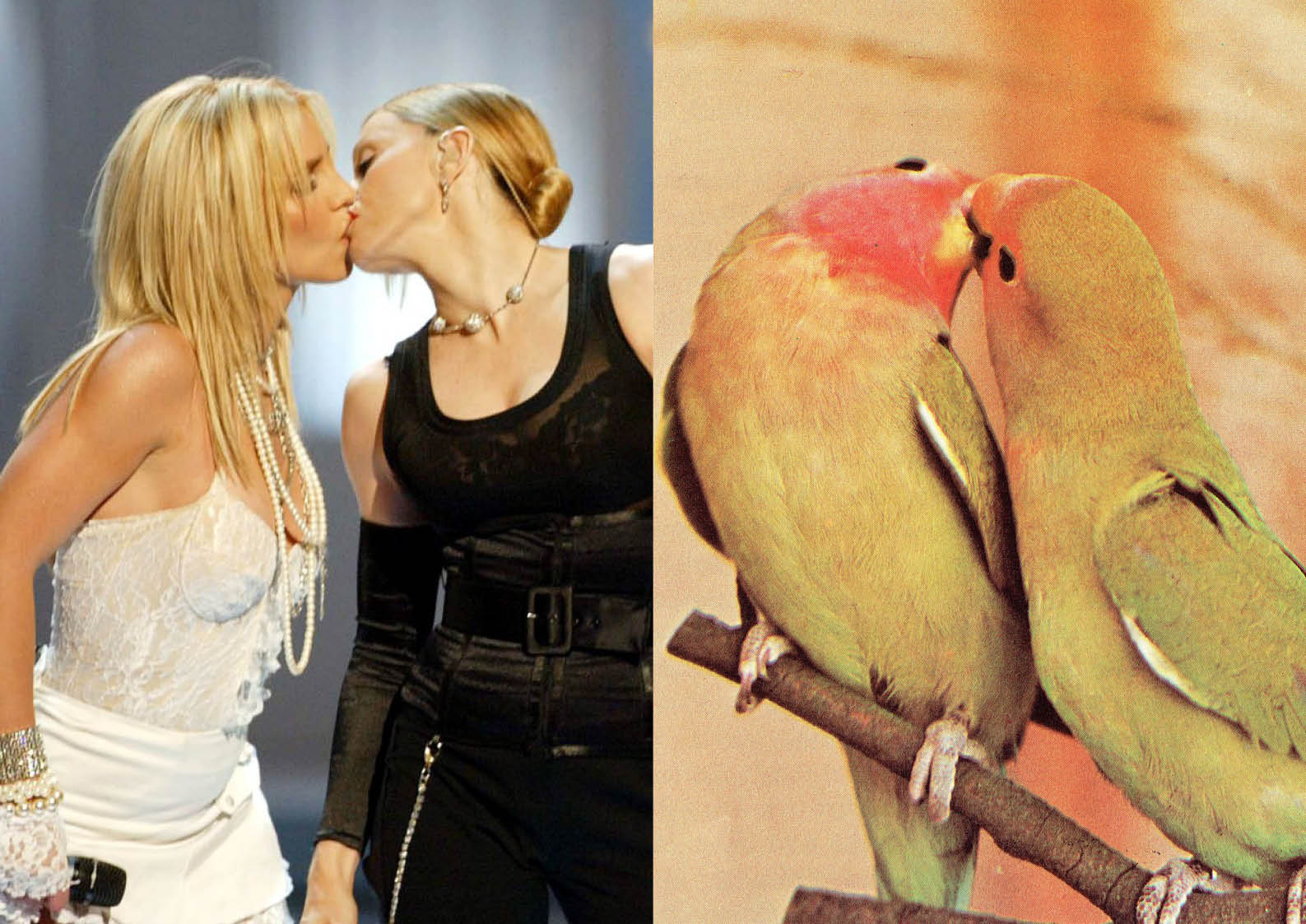
In response to the initial research undertaken in preparation for the extended essay, About Honey was perceived as a reaction against the many commercial gays mens magazine dominating queer spaces. Inspired by the lack of obviously queer and lesbian iconography in mainstream media, it aims to provide an alternative, youthful interpretation of lesbian history. Using found imagery and text from books, magazines, tv, films it will consider how both archival and current material can be used to curate a unique narrative of an under-represented, and often misrepresented, history of the lesbian identity.
Images and text used do not have to be explicitly queer, rather provide a representation of queer culture as seen through the eyes of a generation of young lesbians who grew up though the 1990's and early 2000's, who sought validation through projecting a queer identity onto a mostly straight mass media.
About Honey originated as an idea to create a small, low-budget zine to be distributed among the immediate community, as per most traditional queer publications. However, research indicated that there may be merit in reaching beyond zine publications in order to create a more visible identity for the lesbian community in the public eye. The project then expanded into a larger, higher quality publication that could be distributed in a number of independent book stored.