Thursday, April 20, 2017
Monday, April 17, 2017
OUGD501 - Studio Brief 02 - Final Resolutions For The Aldi Rebrand
The final resolutions for the rebrand of Aldi are shown below in vector format and in-situ:


Feedback on these final designs was conclusive in that these logos can be considered a successful design resolution. They are a modern and fresh regeneration of the company's branding that appeals to the brand's target audience of young professionals, students and families. The overall design of the logo can be considered more professional that its predecessors, yet still accessible to a wide audience. The colour schemes used for each side of the company both reflect the values of the Aldi Brand and advertise a company that provides quality reliable products at a competitive price.
The project as a whole was informed throughout by thorough researched and a range of formative and summative feedback from peers, tutors and selected individuals from Aldi's target market, resulting in a successful and appropriate resolution to the brief. This rebrand has fully utilised the devices of pastiche and parody, regenerating previously existing designs from the Aldi Nord and Aldi Süd brands to create a new rebrand that is current and applies to the regulations and ethos of the Aldi company. Using the definitions of parody and pastiche defined within the essay - pastiche was defined as 'an artistic work in a style that imitates that of another work, artist, or period' and parody was defined as 'an imitation of the style of a particular writer, artist, or genre with deliberate exaggeration for comic effect' - the final resolutions can be considered a pastiche of the original brand, rather than a parody. This rebrand uses the strongest elements of the existing designs to create an effective and cohesive design solution for one of the largest supermarkets in Europe.
A range of computer programmes were used in the production of this rebrand. Firstly Adobe Photoshop was used to edit the original logos in order to create the initial mock-ups as it provided the freedom to quickly edit and arrange the multiple elements of each design. The final design was then created from the mock-up's using Adobe Illustrator. This allowed the design to be created in a vector format so that it could be edited more precisely and scaled to any size for a range of applications including shopping bags, magazine adverts, lorries, billboards and large scale banners.

Logos for Aldi Süd and Aldi Nord


Examples of applications for the branding
Feedback on these final designs was conclusive in that these logos can be considered a successful design resolution. They are a modern and fresh regeneration of the company's branding that appeals to the brand's target audience of young professionals, students and families. The overall design of the logo can be considered more professional that its predecessors, yet still accessible to a wide audience. The colour schemes used for each side of the company both reflect the values of the Aldi Brand and advertise a company that provides quality reliable products at a competitive price.
The project as a whole was informed throughout by thorough researched and a range of formative and summative feedback from peers, tutors and selected individuals from Aldi's target market, resulting in a successful and appropriate resolution to the brief. This rebrand has fully utilised the devices of pastiche and parody, regenerating previously existing designs from the Aldi Nord and Aldi Süd brands to create a new rebrand that is current and applies to the regulations and ethos of the Aldi company. Using the definitions of parody and pastiche defined within the essay - pastiche was defined as 'an artistic work in a style that imitates that of another work, artist, or period' and parody was defined as 'an imitation of the style of a particular writer, artist, or genre with deliberate exaggeration for comic effect' - the final resolutions can be considered a pastiche of the original brand, rather than a parody. This rebrand uses the strongest elements of the existing designs to create an effective and cohesive design solution for one of the largest supermarkets in Europe.
A range of computer programmes were used in the production of this rebrand. Firstly Adobe Photoshop was used to edit the original logos in order to create the initial mock-ups as it provided the freedom to quickly edit and arrange the multiple elements of each design. The final design was then created from the mock-up's using Adobe Illustrator. This allowed the design to be created in a vector format so that it could be edited more precisely and scaled to any size for a range of applications including shopping bags, magazine adverts, lorries, billboards and large scale banners.
Friday, April 14, 2017
OUGD501 - Studio Brief 02 - Fourth Designs
The selected logo designs are shown below, featuring an alternative thicker border with paired back colours:


Upon review of these variations of the designs, the most appropriate logo for the Aldi Nord company (right) is design (b) as it incorporates all of the original colours, creating a striking combination that creates an impactful brand, and also adhere's to the layout of the previous Aldi (2006) logo. The most appropriate logo for the Aldi Süd company (left) is design (c). Although design (a) matches the respective design for the other half of the brand, (c) provides a more unique alternative for Aldi Süd, which would ensure that the companies retained their separate identities while still forming a new sense of cohesion.
A key element introduced during the new Aldi rebrand (2017) was an additional 3D effect applied across the logo to align with the brand's ongoing modernisation. It was suggested that this could also be applied to this rebrand (show below), however once tested it was felt by most individuals that the effect actually gave a more immediately out-dated and low-tech appearance. The flat vector logo also had a noted retro feels but it was discussed that this would not be date so easily and also represented the deliberate explorations of the company's history and heritage as a family run business. Therefore the 3D manifestations of these logos were disregarded in favour of the flat vector variations.


(a) and (b)

(c) and (d)
Upon review of these variations of the designs, the most appropriate logo for the Aldi Nord company (right) is design (b) as it incorporates all of the original colours, creating a striking combination that creates an impactful brand, and also adhere's to the layout of the previous Aldi (2006) logo. The most appropriate logo for the Aldi Süd company (left) is design (c). Although design (a) matches the respective design for the other half of the brand, (c) provides a more unique alternative for Aldi Süd, which would ensure that the companies retained their separate identities while still forming a new sense of cohesion.
A key element introduced during the new Aldi rebrand (2017) was an additional 3D effect applied across the logo to align with the brand's ongoing modernisation. It was suggested that this could also be applied to this rebrand (show below), however once tested it was felt by most individuals that the effect actually gave a more immediately out-dated and low-tech appearance. The flat vector logo also had a noted retro feels but it was discussed that this would not be date so easily and also represented the deliberate explorations of the company's history and heritage as a family run business. Therefore the 3D manifestations of these logos were disregarded in favour of the flat vector variations.


Friday, April 7, 2017
OUGD501 - Studio Brief 02 - Third Designs
Taking into account the feedback that concluded the logos design should feature the half 'A' symbol split over the two logos, new range of designs were created with addition of colour. First for the individual logo that would be used for Aldi Süd, and then for both logos together as a pair.
The first colour experiments (below) revealed that combining colours from both halves of the Aldi companies created some unusual and clashing combinations and became clear that a more limited colour scheme would create a more professional and well-rounded design.

Additional colour experiments (below) confirmed the theory that a limited colour scheme would create a more cohesive design. It was suggested in a peer critique that a white background within the logo gave a more contemporary feel, as apposed to a colour-filled background which gave a more dated and retro appearance. It was also agreed that using a different colour scheme for each side of the logo would represent the different sides of the company more effectively rather than merging the two into one, as each company is unique from the other. Throughout the design process it was also concluded that the inclusion of a double border gave the design a more refined appearance and would allow for the multiple coloured borders on the Aldi Süd logo (2006) to be replicated and renewed.

Feedback on the final coloured designs (below) revealed the new colour combinations to be successful. There was postive feedback on the use of the red as a primary colour for the Aldi Nord logo (right) and it was agreed in a critique group that the use of a navy blue as the primary colour within the Aldi Süd logo (left) provided a sharper contrast than the orange. The overall preferred colour combinations were logos (c), (d), (e) and (h).
However it was pointed out that using multiple colours around the border would make impact negatively on the possible scale of the logo. At a large size the different colours would be easily distinguishable, however at a small scale the boundary box would lose clarity and create an undefined edge to the outside of the design. To rectify this, a thicker border with fewer colours will be applied to ensure that the logo can be used at all sizes.


The first colour experiments (below) revealed that combining colours from both halves of the Aldi companies created some unusual and clashing combinations and became clear that a more limited colour scheme would create a more professional and well-rounded design.

Colour experiment #1
Additional colour experiments (below) confirmed the theory that a limited colour scheme would create a more cohesive design. It was suggested in a peer critique that a white background within the logo gave a more contemporary feel, as apposed to a colour-filled background which gave a more dated and retro appearance. It was also agreed that using a different colour scheme for each side of the logo would represent the different sides of the company more effectively rather than merging the two into one, as each company is unique from the other. Throughout the design process it was also concluded that the inclusion of a double border gave the design a more refined appearance and would allow for the multiple coloured borders on the Aldi Süd logo (2006) to be replicated and renewed.

Colour experiment #2
Feedback on the final coloured designs (below) revealed the new colour combinations to be successful. There was postive feedback on the use of the red as a primary colour for the Aldi Nord logo (right) and it was agreed in a critique group that the use of a navy blue as the primary colour within the Aldi Süd logo (left) provided a sharper contrast than the orange. The overall preferred colour combinations were logos (c), (d), (e) and (h).
However it was pointed out that using multiple colours around the border would make impact negatively on the possible scale of the logo. At a large size the different colours would be easily distinguishable, however at a small scale the boundary box would lose clarity and create an undefined edge to the outside of the design. To rectify this, a thicker border with fewer colours will be applied to ensure that the logo can be used at all sizes.

Colour experiment #3


Best colour combinations
Wednesday, April 5, 2017
OUGD501 - Studio Brief 02 - Colour Scheme
Moving forward with these designs, the next stage of the rebrand process is to create a colour scheme to be used throughout the branding. To use as many pastiche elements as possible within this project, the new logos will feature only the original colours from the existing logos of the Aldi Nord and Aldi Süd brand. Although both companies use a different range of colours, there are some similarities. Both use the same shade of light blue and both use a dark navy blue, although the navy used in the Aldi Süd branding is slightly darker and less rich.
When discussing the range of colours used throughout both of the Aldi brands it was concluded that the colour palette of the Aldi Süd company most accurately represented a company that provided cheap, every-day and off-brand products due to the inclusion of a bright yellow and orange. These colours are typically received as less professional, more naive and even whimsical. The colour scheme of the Aldi Nord brand, however, was perceived to be more corporate and traditional.
The original aims of the rebrand were to change the perceptions of the brand to that of a reliable yet cheap supermarket amongst its competitors, while still appearing fresh and modern and appealing to the target audience of young adults and families.
Considering this, the new logos will aim to use a limited mix of colours from both sides in order to fully represent the brand as a whole.


Tuesday, April 4, 2017
OUGD501 - Studio Brief 02 - Second Designs
After receiving feedback on the most successful designs it was also discussed that the rebrand should feature a second logo for Aldi Nord, which would also include elements from the Aldi Süd branding.

Using the most appropriate designs from those identified, a selection of possibilities were created (below). These designs represent two halves of the company combined in order to create a more cohesive brand. When presented in a second group critique there was a majority of positive feedback towards the top sets of designs, featuring the full letter 'A' found in the Aldi Nord branding split into two, with half used on either side. It was agreed that utilising the half symbol on both sides provided a more effective use of space within the logo and also allowed the two halves of the company to be combined whilst still allowing the two separate brands to retain unique and individual identities.


Using the most appropriate designs from those identified, a selection of possibilities were created (below). These designs represent two halves of the company combined in order to create a more cohesive brand. When presented in a second group critique there was a majority of positive feedback towards the top sets of designs, featuring the full letter 'A' found in the Aldi Nord branding split into two, with half used on either side. It was agreed that utilising the half symbol on both sides provided a more effective use of space within the logo and also allowed the two halves of the company to be combined whilst still allowing the two separate brands to retain unique and individual identities.

Thursday, March 30, 2017
OUGD501 - Studio Brief 02 - Logo Specifications and First Designs
Based on the results of the questionnaire there are many factors that need to be considered when creating a rebranded logo for the Aldi company.
The new logo must feel contemporary and modern to reflect the company's current vision of modernising and progressing and a large supermarket brand. The logo need to feel relevant to a wide target audience - primarily young adults and young professionals with a small disposable income aged between 18-35, but must also feel accessible to an older audience aged between 40-50. A potentially limited colour palette would give the brand more authenticity and reverse the perception that Aldi is an off-brand and tacky company. Currently the brand appeals to both male and female consumers equally, so the continuation of a gender neutral brand is essentially to retaining the existing target market.
Baring these factors in mind, a range of initial logo ideas for Aldi Süd were created using existing elements from the previous logos of both sides of the company:


The 'A' symbols from both existing logos were used during this experimental phase, and the original typeface used throughout the majority of the existing logos. When presenting this range of mock-up's in a peer group critique there was a range of positive feedback towards a selection of the designs (below). The majority of feedback given highlighted the simplicity of the new designs compared to the original Aldi logo. Feedback revealed that design 3 was more representative of the most recognisable Aldi logo (2006), which featured an isolated half-A symbol. However it was felt that extending the 'A' symbol to touch the box outline (as seen in design 1 and 2) was more effective as it creates fewer areas of unused negative space and gives the symbol more weight. This design decision resulted in the repositioning of the text element outside of the box, which was preferred by the critique group as it gave the name more clarity throughout the overall design. Design 4 incorporates the new element of a full 'A' symbol created for the 2017 rebrand, however this received mixed feedback within the critique group. Some felt that it represented a progression within Aldi's branding, but some felt that it was less recognisable as the face of the company and would be off-putting to existing customers.
There was positive feedback for the used of the original typeface as it was agreed that the name of the brand was boldly represented and easily visible in all of the logo designs.


There was additional positive feedback given to the more experimental designs (shown below), as it was felt that they represented a new and progressive direction for the company. However it was also agreed that they appeared strikingly different compared to the original logos and did not utilise enough of the existing elements from Aldi's previous designs. Therefore they do not strictly comply to the concept of pastiche and would be unrecognisable to the company's target market.


The new logo must feel contemporary and modern to reflect the company's current vision of modernising and progressing and a large supermarket brand. The logo need to feel relevant to a wide target audience - primarily young adults and young professionals with a small disposable income aged between 18-35, but must also feel accessible to an older audience aged between 40-50. A potentially limited colour palette would give the brand more authenticity and reverse the perception that Aldi is an off-brand and tacky company. Currently the brand appeals to both male and female consumers equally, so the continuation of a gender neutral brand is essentially to retaining the existing target market.
Baring these factors in mind, a range of initial logo ideas for Aldi Süd were created using existing elements from the previous logos of both sides of the company:


The 'A' symbols from both existing logos were used during this experimental phase, and the original typeface used throughout the majority of the existing logos. When presenting this range of mock-up's in a peer group critique there was a range of positive feedback towards a selection of the designs (below). The majority of feedback given highlighted the simplicity of the new designs compared to the original Aldi logo. Feedback revealed that design 3 was more representative of the most recognisable Aldi logo (2006), which featured an isolated half-A symbol. However it was felt that extending the 'A' symbol to touch the box outline (as seen in design 1 and 2) was more effective as it creates fewer areas of unused negative space and gives the symbol more weight. This design decision resulted in the repositioning of the text element outside of the box, which was preferred by the critique group as it gave the name more clarity throughout the overall design. Design 4 incorporates the new element of a full 'A' symbol created for the 2017 rebrand, however this received mixed feedback within the critique group. Some felt that it represented a progression within Aldi's branding, but some felt that it was less recognisable as the face of the company and would be off-putting to existing customers.
There was positive feedback for the used of the original typeface as it was agreed that the name of the brand was boldly represented and easily visible in all of the logo designs.

Design 1

Design 2
Design 3

Design 4
There was additional positive feedback given to the more experimental designs (shown below), as it was felt that they represented a new and progressive direction for the company. However it was also agreed that they appeared strikingly different compared to the original logos and did not utilise enough of the existing elements from Aldi's previous designs. Therefore they do not strictly comply to the concept of pastiche and would be unrecognisable to the company's target market.


Friday, March 24, 2017
OUGD501 - Studio Brief 02 - Questionnaire Results Analysis
After seven days of promotion, the questionnaire gained 41 responses. The results are as follows:
29 respondents are Female
12 respondents are Male
Ages of respondents ranged from 20 to 50+, with the majority being young adults in their 20's
34 respondents are Students
1 respondent is a Scientist
1 respondent is a Headteacher
1 respondent is a Teacher
1 respondent is a Merchandiser
1 respondent is a Musician/Music Teacher
1 respondent is Self-Employed
1 respondent works Freelance
90% of respondents shop at Aldi
10% of respondents do not shop at Aldi
The majority of respondents who did shop at Aldi used the shop semi-regularly, between once a week and once a month
Of those who did not use Aldi, the majority of respondents did not shop there because it was too far away from where they lived, and so used other supermarkets for convenience
When asked what their perceptions were of Aldi as a brand, the majority of respondents said that it was cheap, budget and reliable, with others also saying that the brand felt accessible and fresh
When asked what their perceptions of the new Aldi rebrand (2017), answers were mixed - most felt that it was modern and corporate, but also that it was tacky. 20% of respondents felt the logo was badly designed, and it was clearly indicated that 30% of respondents felt that it accurately represented their perceptions of a cheap and budget brand.


When analysing these results it is clear that although Aldi is not necessarily the preferred choice out of all of the supermarkets available, it provides cheap and fresh food to students, young professionals and families looking to shop on a budget. To the general public the logo and branding represents an off-brand but reliable company, and is successful for advertising to that specific target audience. However when the current logo is analysed from a design perspective there are many inaccuracies which need to be improved. The branding as a whole across the Aldi Süd company currently represents certain qualities that may be appealing to the target audience, such as cheap and off-brand, but could actually cause damage to Aldi's reputation and create disadvantages for the company compared to the other leading supermarkets.
Thursday, March 16, 2017
OUGD501 - Studio Brief 02 - ALDI Brand Research Continued
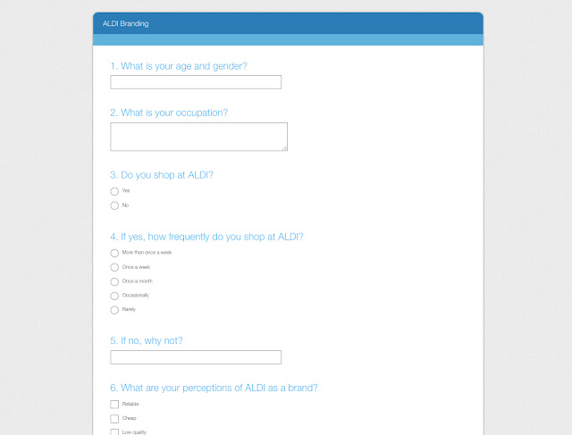
Further research into the brand must include factual information on the brand's demographic, including but not limited to age, gender, occupation, class, location, perception of the brand, personality, taste, interests etc. The most effective way to do this is through a live questionnaire that will survey a small sample of product consumers.
Questions to be included in the questionnaire:
What is your age?
What is your occupation?
Do you shop at ALDI? Yes, No
If yes, how frequently? More than once a week, once a week, once a month, occasionally, rarely
If no, why not?
What are your perceptions of ALDI as a brand? Reliable, cheap, low quality, youthful, accessible, everyday, budget, off-brand, limited choice, fresh, old
Where do you most often see branding for ALDI stores? Television advert, magazine advert, billboards, bus shelter adverts
Considering that the target market for Aldi and this questionnaire is young professionals, students and families, it is more effective to ask questions relating to the general perception of the brand in every day life as apposed to more specific questions about the physical design of the logo. The majority of individuals within the target market will not have an in-depth knowledge of the role that graphic design plays within advertising and branding, and therefore questions of a more generic nature will produce answers that will give a more accurate representation of the brand's audience.
The questionnaire was created using Surveymonkey and then launched through social media channels for the duration of one week.


Questions to be included in the questionnaire:
What is your age?
What is your occupation?
Do you shop at ALDI? Yes, No
If yes, how frequently? More than once a week, once a week, once a month, occasionally, rarely
If no, why not?
What are your perceptions of ALDI as a brand? Reliable, cheap, low quality, youthful, accessible, everyday, budget, off-brand, limited choice, fresh, old
What are your perceptions of the current ALDI logo? Modern, friendly, tacky, welcoming, naive, corporate, retro, aesthetically pleasing, progressive, off-putting, well designed, badly designed, accurate representation of your perceptions of the ALDI brand
How often do you see branding for ALDI stores? More than once a week, once a week, once a month, occasionally, rarely
Which logo would you make you the most likely to shop in ALDI? (image examples)
Considering that the target market for Aldi and this questionnaire is young professionals, students and families, it is more effective to ask questions relating to the general perception of the brand in every day life as apposed to more specific questions about the physical design of the logo. The majority of individuals within the target market will not have an in-depth knowledge of the role that graphic design plays within advertising and branding, and therefore questions of a more generic nature will produce answers that will give a more accurate representation of the brand's audience.


Wednesday, March 15, 2017
OUGD501 - Studio Brief 02 - ALDI Brand Research
Moving forward with the concept of rebranding a modern company, initial research into existing companies that are due for a rebrand, or have currently undergone a rebrand, produced many possibilities that could be used as a basis for this body of work. Possibilities included Marks and Spencers and Subway, however the most appropriate example appeared to be the German retail chain Aldi.
In early 2017 the Aldi company teamed up with German consultancy Illion Markensocietaet to create a refreshed, modernised rendering of their logo. Research suggested that the reaction to the rebrand had mostly been negative, and many designers felt that the new 3D effect and richer colour palette lead the company in a different, and worse, direction.
Rebranding Aldi could be achieved more successfully by looking back into the history of the company and the past manifestations of the company's designs, and then re-using the most successful elements to create a contemporary and appropriate logo.
Researching further into Aldi's design history revealed many possible options for my own rebrand:
Brand History
Aldi has over 10,000 stores in 18 countries and an estimated combined turnover of more than €50 billion.
Based in Germany, the chain was founded by brothers Karl and Theo Albrecht in 1946.
The brothers built up a chain of stores until, by 1960, they owned 300 shops, and split the operation into two separate groups, that later became Aldi Nord and Aldi Süd.
In 1962, they introduced the name Aldi (a syllabic abbreviation for Albrecht Diskont).
The two operate independently, each within distinct geographical areas and both are among the world's largest privately owned companies.
Karl Albrecht retained ownership of Aldi Süd, and with a personal wealth of €17.2 billion, he is the richest man in Germany, whereas the co-owners of Aldi Nord, Berthold and Theo Albrecht Jr., follow close behind at €16 billion.
Dieter Schwarz, owner of Lidl and Kaufland came in third, with a fortune of €11.5 billion
Aldi's German operations consist of Aldi Nord's 35 individual regional companies with about 2,500 stores in western, northern, and Eastern Germany, and Aldi Süd's 32 regional companies with 1,600 stores in western and southern Germany
Between the two companies Aldi now operates 4000 stores worldwide
Logo History
The two stores Nord and Süd have distinct logos
Nord displays the entire 'A' for ALDI while Süd unveiled a logo in 1982 which displays only half
In 2006, ALDI Süd modified the logo slightly and then in March 2017, unveiled a new logo which revealed a more rounded look for the logo and a new font for the word 'ALDI', further differentiating it from the ALDI Nord logo which had shared the same font for the brand until then.
Aldi Süd logo history

Aldi Nord logo evolution


Physical logo comparison
Logo Analysis

Comparing the two logos of Aldi Nord and Aldi Süd, the similarities and differences are apparent. On the left is the 2017 rebrand of the Aldi Süd. This new logo was described as a contemporary redesign in alignment with the brand's move towards modernisation, however there appear to many flaws to this design. The uneven stroke widths of the multiple coloured borders give an unevenness to the logo that simultaneously draw the eye in towards the centre and back towards the outer border. The alignment of the elements within the rectangle is also weighted towards the top, leaving a larger and uneven space at the bottom. The use of bevel highlights give the logo a more retro appearance as apposed to modernising it and the dark background makes the rest of the logo appear to float, and it somewhat reminiscent of an airline brand. Reactions amongst the design industry were also varied, with a mostly negative reaction towards the new 3D effect and richer colour palette.
The Nord logo in comparison is far more evenly designed, with even weighting given to the logos elements as a whole. The logo has a distinctly retro feel and the more limited colour palette provides much needed simplicity. A single red stripe around the perimeter defines the logo with a clear border that encapsulates the brand and makes it easily distinguishable.
Crucial similarities throughout the brand's logo history appear to be inclusion of the single letter A as an icon for the brand, which has been a continued elements since the 1980's. The static arrangement of the logos elements have also withstood the test of time as the brand name remains as a feature at the base of the logo. The curvature of the ends of the lines that make up the letter A can be seen to reappear throughout the progression of both the Nord and Süd logos over time. Up until the early 2000'd both strands of the company used the same typeface within their branding, and the 2006 logo for Aldi Süd featured a slightly altered version of this typeface that was only slightly narrower in width. In the 2017 rebrand they typeface was changed altogether to feature a more slender and curved typeface.
Although the Nord and Süd strands of the Aldi brand exist as two separate entities, many of each of the companies stores operate in the same countries, creating confusion for consumers and an in-cohesiveness between the two companies and the brand as a whole.