Tuesday, October 27, 2015

OUGD401 - Study Task 04 - Summarising and Paraphrasing

Analysis of Graphic Design Theory by Meredith Davis:

During this short excerpt from Graphic Design Theory Davis highlights many interesting points about the 'convergence of medias' in the design world today. Most notably is the idea that 'new' does not replace 'old', in that 'media convergences occur regularly and constitute an evolutionary process, not a fixed point in time when one medium instantly displaces another' [1]. New media's, such as the introduction of the Apple computer, or even the more widespread use of programmes such as photoshop, were each required to go through an adjustment period before being considered an essential part of the designers arsenal. 

Davis states that 'inherited forms and traditions limit and inhibit, at least at the start, a full understanding of the intrinsic or unique potential of emerging technologies' [2]. By this she means that old and traditional 'trades' such a printing and typesetting hold the basic skills needed to understand graphic design as both a discipline and a profession, therefore it is impossible to rule these out as non-essential when the computer is introduced as the same skills still apply, only this time in a digital format. However, these 'old' skills limit our initial understanding of new medias as with each new technology, more is possible than ever before in terms of design, production, output etc. It is only once 'old' and 'new' find a harmony that the technology can become fully integrated into the design world. Moreover, 'we must resist notions of media purity, recognising that each medium is touched by, and in turn touches, its neighbours and rivals' [3]. No particular media can exist by itself - all draw influences and skills from many other areas within both design and more broadly from art. Each challenges the capabilities of those it sits beside and this is the driving force behind the exponential growth of design medias we are seeing today. 

However, new medias should not be considered solutions to old problems, they are simply alternatives to the way we design and create. Neither is better or worse than the other, and 'the collision and convergence of old and new produces outcomes that often define particular periods in our technological history' [4]. It is the continuing evolution of the tools of design that push the boundaries of what is possible, and what defines us as both individual designers and as a generation.


(1) Davis, M. (2012). A New Paradigm. In: Graphic Design Theory. London: Thames and Hudson. 212.
(2) Davis, M. (2012). A New Paradigm. In: Graphic Design Theory. London: Thames and Hudson. 213.
(3) Davis, M. (2012). A New Paradigm. In: Graphic Design Theory. London: Thames and Hudson. 213.
(4) Davis, M. (2012). A New Paradigm. In: Graphic Design Theory. London: Thames and Hudson. 212.

Tuesday, October 20, 2015

OUGD401 - Study Task 03 - Reading and Understanding a Text

As a way of introduction to reading and analysing academic texts for our chosen essay question, I read an excerpt from the book Graphic Design Theory by Meredith Davis. Chapter: A Convergence of Media. 

5 Key Points that Davis makes:
  1. New does not replace old, but integration happens over a period of time
  2. Disputing that new technologies displace older systems with decisive suddenness 
  3. No media exists purely by itself
  4. Old formats can’t keep up anymore
  5. We need more forms of media outlets


5 Quotes from the text:
  1. 'The collision and convergence of old and new produce outcomes that often define particular periods in our technological history'
  2. 'Media convergences occur regularly and constitute an evolutionary process, not a fixed point in time when one medium instantly displaces another'
  3. 'Inherited forms and traditions limit and inhibit, at least at the start, a full understanding of the intrinsic or unique potential of emerging technologies'
  4. 'We must resist notions of media purity, recognising that each medium is touched by in and turn touches its neighbours and rivals'
  5. 'An increasingly intricate web of interactions among people, objects, and settings


The tone of voice was very formal and authoritative, naturally as Davis was a Professor of Graphic Design at NC State University and is a multi-published author. The text is factual and well researched, and references to designers, theory and other works and scattered liberally. 

Thursday, October 15, 2015

OUGD401 - Study Task 02 - Finding Research Sources

When undertaking project research there are a variety of sources that could be used: books (or google books online) can come in the format of text/research books, documentation books, or even autobiographies. Information online can come from known establishments - such as galleries and museums, magazines etc - or even from blogs.

We were given the task to research methods of 'protest graphics', finding at least two distrinct research sources and evaluate each accordingly:


Disobedient Objects, Catherine Flood (2014)

'The book explores the material culture of radical change and protest - from objects familiar to many, such as banners or posters, to the more militant, cunning or technologically cutting-edge, including lock-ons, book-blocs and activist robots'

This book was published alongside an exhibition of the same name that showed at the V&A in London from July 2014 to February 2015. It documents a broad range of materials used in protests and therefore gives a wide picture or protest movements through the ages. The book comes from a reliable source as the V&A has a known reputation.


'Beauty is in the Street: The Power of Protest Posters', Justin McGuirk, 2011

'Beauty is in the Street' was an article published on The Guardian website detailing the Paris Uprising of May 1968, and the role that street posters and flyers played to gather public and media attention. Again, the article comes from a reputable source, but The Guardian has known left-wing political views and so information they publish may have a biased attitude.

http://www.theguardian.com/artanddesign/2011/may/23/beauty-in-street-posters-protest

Wednesday, October 14, 2015

A 20,000 Year Non-Linear History of the Image

'A 20,000 Year Non-Linear History of the Image' was an introductory lecture on the history of the image. Detailing the start of 'visual communication' through the medium of cave paintings in Lascaux, France (approx. 17,300 years old), it drew links between these early examples and more contemporary artists such as Cy Twombly, stating that despite time and cultural differences, both exhibit the same act of pure mark making.

There were interesting points made about artists such as Rothko, and their ability to communicate emotions and/or physical feelings through the use of only one or two colours. It is said that viewing Rothko's paintings is like 'looking into a void' and that many people cry when surrounded by his work in the Rothko Chapel. However the question was then posed that people may experience these emotions simply because of the 'framing' of these paintings (the stories that surround them, the story of Rothko's suicide) - people subconsciously think they have been told to feel these emotions, and so do. We were then asked to decide if we thought these paintings communicated anything at all. Personally I think they do - they are a reflection of the viewer, and the subconscious knowledge of the 'framing' of his paintings only adds to the experience.


Tuesday, October 6, 2015

OUGD401 - Study Task 01 - Image Analysis

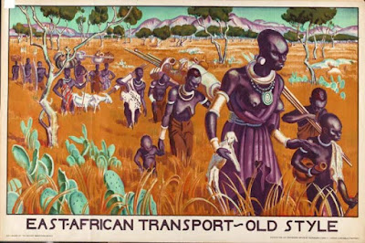
A session about visual literacy - comparing two images by analysing historical, cultural, political, societal and technological indicators to determine what era they would have been produced in. Other factors to consider include the choice and organisation of font and style of illustration, the purpose and meaning, and the potential audience of the images.


The first image (above), produced 1876, was from the time of the American war of independence, or just after. Societal indicators show that men were still very much in power at this time as there is only one woman present in the image, as she is serving the food. We also know that this image was produced within the era of the slave trade as a person of colour is featured cooking on the far left of the image. 

The image was actually intended to advertise a line of 'Uncle Sam Ranges', or cookers. The image dictates America, represented by the figure of Uncle Sam, in a meeting with it's allies (the three figures at the back of the image - England, the 'Dixie' South, and the West) and the rest of the world. It celebrates America as a generous nation who is extending a hand, and food, to other countries around the world. So in this sense the image acts as an early form of American propaganda. 


The second image (above) comes in two parts. Both are from the 1930's, and the typography and illustration style are typical of this era. They are more 'designed' than the previous image and the rich use of colours were intended to catch the eye, which is appropriate as these images were intended to be used as a form of advertisement for the East African Transport company. Historically, these images are from the time of British colonisation across many parts of the world, and the top image depicts the 'old style' of transport in a recently colonised area of what we could assume to be an African country. It shows a traditional method of transporting goods and/or livestock by carrying them long distances. There are a range of people included in this task, including men, women and children. 

The bottom image however depicts the 'new style' - the introduction of more advance 'technologies' including boats meant the transporting of goods and/or people could be done faster. In the centre of the image is a white man, standing proud with his head up, and surrounding him are people of colour. They are all male which could suggest that in this new era women and children no longer have to take on heavy workloads, but all the men have their eyes cast downwards, suggesting they are now submissive to the white man. Their outfits are also all the same which suggests they are no longer dressing in traditional clothes (as in the top image), and they may even be in a uniform of sorts.

Using a range of indicators it is possible to gain a lot of information about the history, social environment and the cultural context of these images. Many of these indicators are typical of the times in which these images were produced, making it easy to analyse this information quickly.